Sourdough Construction
Brand DirectionWeb DesignDevelopmentMotion
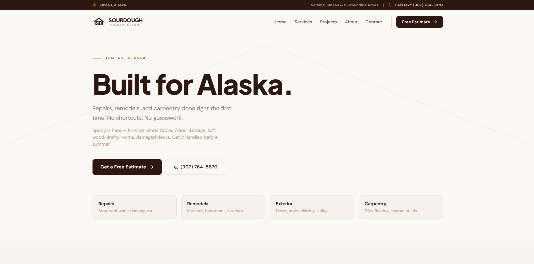
Sourdough wanted to look less like a contractor and more like a studio. We gave them an editorial, photography-led site with motion that earns attention without getting in the way.
The Challenge
Construction sites tend to look the same: stock photos, tired templates, no point of view. Sourdough needed to stand apart while still reading as dependable to everyday clients.
The Approach
We built a typographic system with generous whitespace, scroll-driven reveals, and a project gallery that lets the work speak. Every interaction is tuned to feel intentional, never decorative.
The Outcome
A presence that punches above the firm's size and gives the sales conversation a confident head start — visitors arrive already impressed.
2.8×
Avg. Session Duration
−41%
Bounce Rate
100
Lighthouse Accessibility
Next Case Study